AUD Graphic Design Students: Nuts About Packaging!
AUD’s graphic design students showcased last week at the Rotunda their environmentally-friendly nut snack package designs.
“We’re looking at how much paper we’re using. We’re trying to be good to the environment, minimize waste- printing, and all that,” said Visual Communications Professor Laura Bakalka who coordinated the project.
She challenged her students to get a package without excess materials.
The focus was put not only on packaging, but on branding. Students had to target specific consumers with their product, and support their choices with research.
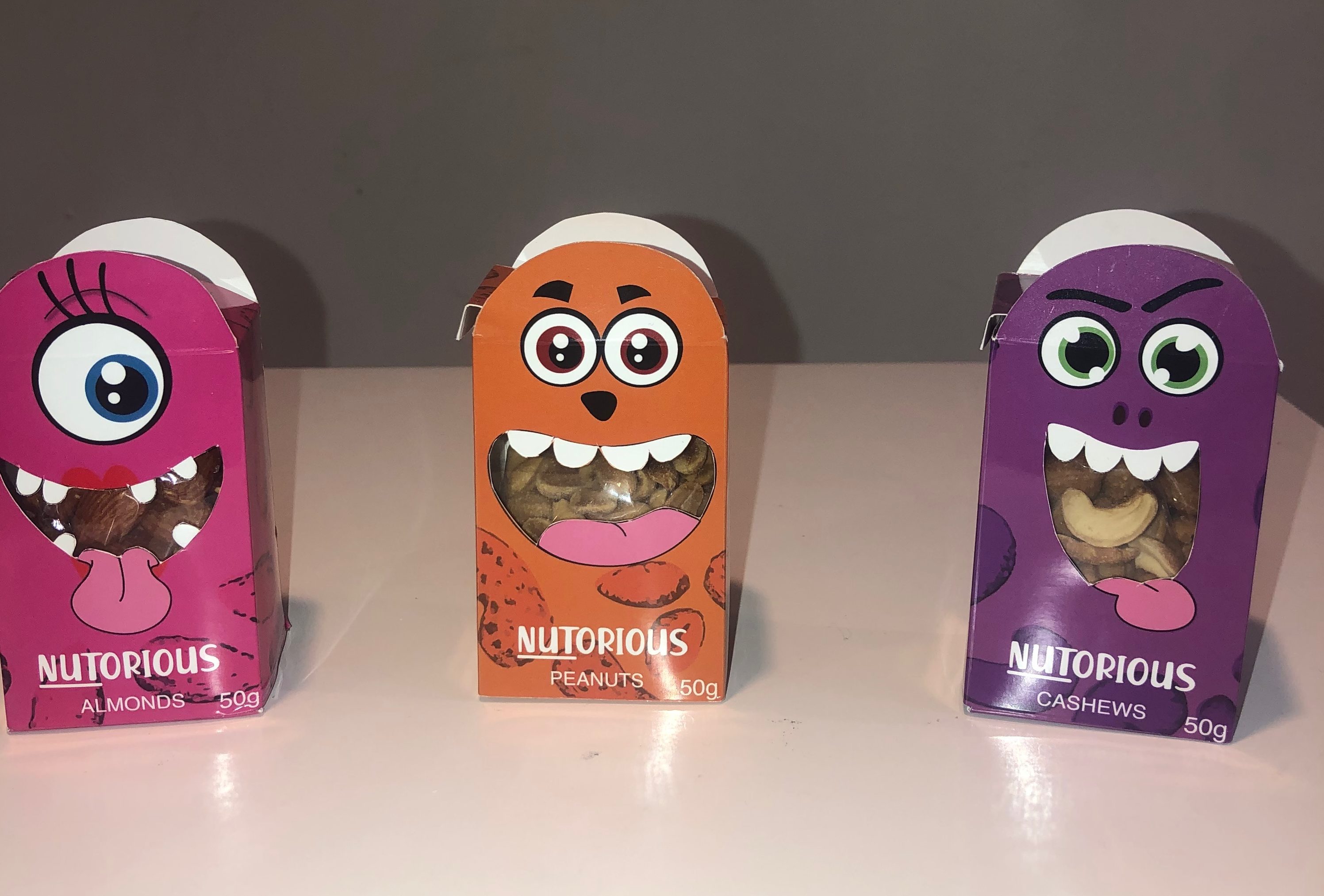
Student Rund Samman designed the packaging of “NUTorious”, targeting children ages 3-11. She chose the name as a play on words as her packaging is covered in cartoon monster illustrations.
“It’s called “NUTorious”, which means evil/bad, [with] a play on words because of word “nut” in it. Each nut is associated with a certain character/monster on the cover,” she told the MBRSC Post.
“Kids don’t usually eat healthy, so this package is made to catch their attention, and have them eat better,” Samman continued.
Packages are the first thing consumers encounter when looking at a product, making it a key factor in marketing, and sales.
“A package is the personality of the product and company, it also keeps the product safe. It’s also a promotional tool that determines if the customer will pick up or pass by the product,” said Samman.
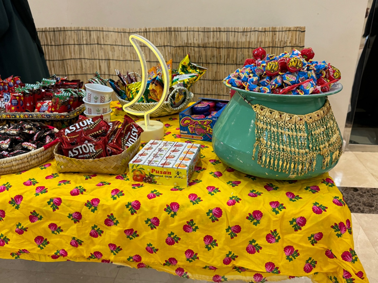
The exhibition showcased eleven graphic design students’ works, making for a diverse array of packages with different concepts, colors and shapes.
Great work. Proud of you Rund.
Dad